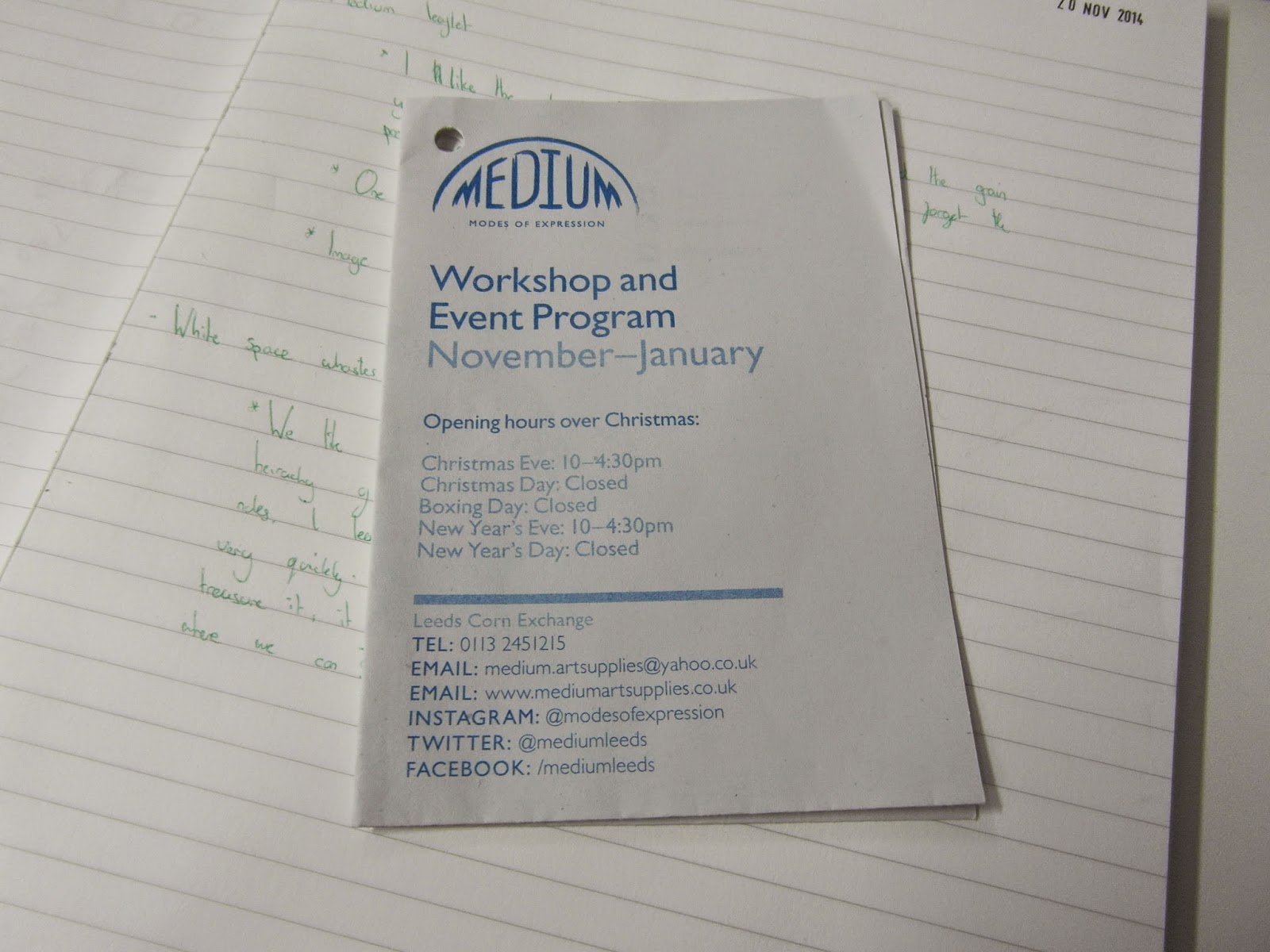

I picked up this leaflet from the Corn Exchange in Leeds and the first thing I noticed was the newsprint style paper they used. It had the thin cheap feel to it which strangely I liked. I liked the grain and grit you can still see in the paper, it had not been bleached or tampered with. I like this because it reminds you of the papers presence, it sounds strange but really you do not notice the paper is there you just see the design, so half of the publication is forgotten about. The floppy feel and grey rough texture just lets you know its there.
I also like the one colour they have used, it keeps the print cheap combined with the newsprint paper. I know it goes against everything a graphic designer is expected to like but I love cheap publications that still look good, not everything needs to cost a fortune to print.